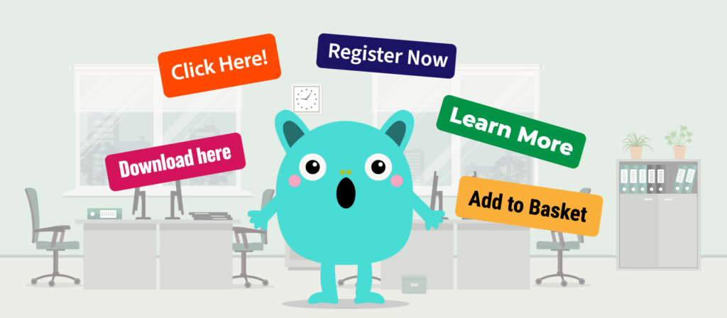
Skip to content

Call-to-Action
How many is too many?

Posted 5th August 2019
kick-ass incentives

Share

Getting the Call-To-Action balance right!

On any website, a well-placed call-to-action (CTA) can make all the difference. From directing a visitor to valuable information that will establish your credibility, to encouraging a lead to start a conversation with you through a contact form.

But how many CTA’s are too many? How few is not enough? It may sound like a question from a tech-inspired version of Goldilocks. But, when it comes to designing a website it’s more important than you may think to get this just right.

That’s because there isn’t a magic number. There’s no definitive answer, because it almost always relies on what is on the page and what the page is trying to achieve.

Not all pages should be designed around a CTA. Sure some will mark the end of the buyer journey and have a prominent CTA to let the visitor know that the next step is to get in touch, sign up to receive more information or register to access a valuable piece of content.

Good content should come first, because, after all, why would a visitor continue to navigate through your website if the content has no value?

Let’s look at some typical pages and how CTA’s work with different content types

When one Call-To-Action is all you need

Only one CTA is needed if your page is geared towards a single action or offer and a visitor does not need any more information from another page, go with one CTA.

Bear in mind that this doesn’t mean you can’t have multiple CTA buttons, just that they all essentially do the same thing.

Examples of pages where this approach works include:

Landing Pages

Standalone pages that present visitors with a single action or choice, like downloading a brochure or registering for a webinar.

Contact Page

You only want to give your visitor one option here!

Individual Product or Service Page

Your visitor has likely navigated through your site to get to this point. Their next move is to get in touch, or more importantly buy now!

When multiple call-to-actions are required

In many ways, it’s easier to know when to use more than one CTA on a page, because the page will be offering multiple routes to the visitor. For tech companies, it could be an industries page which leads to multiple pages categorised by sector, or a products page categorised by model.

These pages are like roundabouts.

Imagine your visitor is driving through your website, trying to make sure they stay on the right road to get to the information that’s most useful to them. They see the roundabout, check the exits and then take the road that gets them to where they want to go.

This is especially useful to keep this idea in mind when adding CTA’s to the most important page on your site – the homepage.

Get your homepage call-to-action right!

The roundabout metaphor can help you to think about your buyer’s journey. You can use your CTA’s to take visitors where they want to go after they arrive on your homepage.

Consider this: When you start a journey in the real world, you don’t go to one massive roundabout that has exits to every location in the country (even if some feel like they do).

It would be overwhelming and confusing, and you’d probably turn around and head home. Well, the same applies to your website.

It’s much more likely you’ll encounter several smaller roundabouts. Each one directing you, in an obvious way, to the best path to take to get to your desired destination.

The signposts (call-to-action) tell you what’s ahead, and what you need to do to continue your journey. You pick up valuable information along the way and complete the trip stress-free.

So don’t overwhelm visitors with CTA’s when they arrive on your homepage. Give them options based on your products or services and narrow down the choices as they navigate through your site.

Quantity and quality balance

With CTA’s it’s a balance between what your visitors want and what you want your visitors to do. You are aiming to provide your visitors with value and the best possible experience. But at the same time, for marketing and lead generation, you’re capturing information about them and their needs.

Too many CTA’s can confuse the visitor and spoil their experience. It can also ruin your lead generation efforts as call-to-action overload can result in the visitor not clicking at all.

When there are too many clickable options = No clicks at all

And too many paths = The visitor gets lost

Too few CTA’s are irritating too. Not providing links where there should be one can be frustrating for visitors. We, as website visitors, have been trained over the years to expect certain things from a website – a product page for your products is a prime example. How often are we now seeing one-page websites? The forever scrolling homepage? Do these pages make the buying journey easier for your visitor?

No clickable options = No lead tracking

Too much scrolling = A sore finger

The key is to think like your visitor and add CTA’s where your visitor would expect to see them.

Special mentions

There are pages where different rules apply:

Blog posts

Consider using one prominent CTA, with multiple in-body reference links and/or further reading links.

Pillar Pages

Same as blog posts, but within the same subject matter.

FAQs

Reference links where and if applicable, with optional prominent CTA to offer.

About page Call-to-actions

No rules! This page should validate you as a business. So, the next step will likely be to link to examples of work and case studies.

For more information on CTA’s and their placements, read more in The Essential Guide to a Better CTA.

Is your website generating high-quality leads and conversions? Because, if not, then a FREE web audit will be the first step to removing any existing conversion barriers.

Back to top